Ahead on Right: Five Actually Creative Directional Billboards
Directional doesn’t have to mean boring. Here are five out of home ads from our archives that elevated the message beyond “Exit Now.”
1. Wasabi Sushi and Steakhouse
Not every business has a main street presence. Wasabi was just a block off the main drag but not easy to see. An arrow would help hungry patrons find it quickly. But just an arrow? Not us. We added a dollop of fun.
2. Spookers Halloween Superstore
There’s so much creative fodder when it comes to Halloween billboards. A simple arrow would have been doing Spookers a disservice, so we turned on fright-mode to boost an expected arrow ad into an unignorable severed hand pointing to the store.
3. Trident General Dentistry
Obviously, no one’s thinking, “Hey, that dentist is just a mile away. I think I’ll stop in.” But sometimes a directional is useful to communicate that a business is in the vicinity, and if you’re a local, this might be a good choice for you.
Rather than a clever headline and a separate directional, we blended them together. Instead of two messages, we have one message the solves the problem in a more interesting way.
4. Good N’ Loud Music
We might have a thing for monster hands. Our brand awareness campaign for Good N’ Loud featured a 7-fingered Rock Monster absolutely shredding a flying-V guitar.
Compared to that, typing out “ahead on left” with no style would have been disappointing. This directional ad extended the concert poster illustration concept to help other Rock Monsters find this music store a little easier.
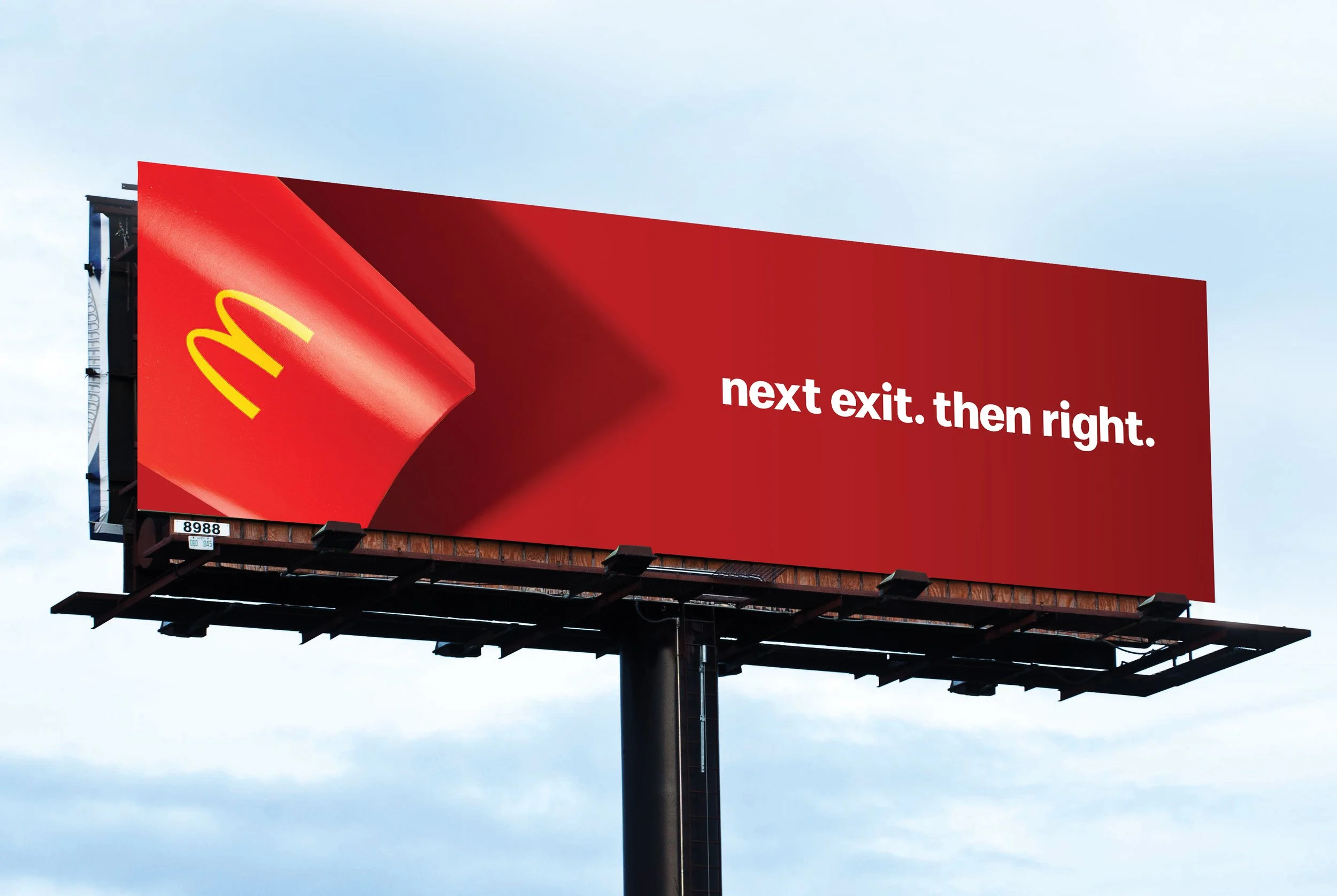
5. McDonald’s
With a brand as iconic as McDonald’s, we don’t need to complicate a directional with price points and product shots. But we did use the packaging to cast shadows that reinforced the directional copy.
Un-f#cking-forgettable directional billboards: just ahead.
We want to be your billboard experts. From creative to planning to celebration. Let’s get up to something.


