Five Deliciously Effective Restaurant Billboards
You’ve seen restaurant billboards. They’re a picture of food, a logo, a headline, and an unwelcome directional. Mostly.
But, what if they weren’t? What if your restaurant billboard were different? What if it actually brought in more traffic? Because it was, I don’t know—interesting?
Well, buckle up. We’re going through our past work, to bring you five examples of unique restaurant billboards that effing sizzled with interest and in turn, put butts in seats.
Tarka Indian Kitchen
Tarka Indian Kitchen built a huge following in Austin, Texas for being fresh, delicious and stupid fast. Mindboggingly fast, for the quality of food folks were gettin’.
They’d recently expanded into Houston, having opened their first store there earlier in 2017. And in that year, they weren’t seeing the response that they’d hoped for. So, they turned to billboards. After speaking with them and discussing their broader campaign goals and history of whimsical pun-friendly marketing, we had a plan. Speak to the scarcity of time on their commute. And do so in a way that stays true to the Tarka brand tone.
Well, the campaign went up and within the first two months, they were swamped. So much so that they needed more staff. They went on a hiring spree because of a single billboard. And yeah, sales went up. Way up.
McDonald’s
A McDonald’s franchise group in Charleston, SC was looking to try something new with their restaurant billboards. This is a McDonald’s, mind you—not some unknown darkhorse of a restaurant—we’re talking the restaurant that is known to most everyone, everywhere.
It didn’t matter. McDonald’s understood that it’s one thing for their audience to be aware, and another for their audience to keep them top of mind. Knowing this, they wanted to try consecutive restaurant billboards—or a Burma Shave, for those looking to pick up some industry lingo—to advertise their Frozen Strawberry Lemonade. Our campaign was simple, treat the billboards like a storyboard for a movie, where each board brings you further along in the Frozen Strawberry Lemonade making process—where at the end, you then have the product.
To say it was a success would be an understatement. Slushy machines were f#cking breaking left and right. They were constantly having to replace them on account of demand—the parts couldn’t keep up. And the Frozen Strawberry Lemonade was a prized commodity.
Bojangles
The Bojangles franchises in South Carolina weren’t doing so well. The food wasn’t poppin’, the service wasn’t great, and the advertising was dead.
That’s when a new franchisee stepped in and reset the entire operation. They took the time to look inward at what went wrong and how to fix it. They retrained the staff. They upgraded the interiors. And then, after their house was in order, they started talking about the advertising (never the one before the other, never). Knowing this, we were able to tailor a campaign that spoke to what made Bojangles so damn unique—their “made from scratch” ethos.
After leading with the “Made From Scratch” campaign on several Bojangles restaurant billboards, their sales started to climb. Billboards got consumers there, but the internal improvements kept ’em coming back. And word spread, until by year’s end, sales had risen a staggering 20%.
Sonic
Sonic was what Dairy Queen used to be in every small town in America—consistently constant. Known for their Sonic Slushs and throwback-menu-meets-today’s-hearty-appetite, they were aware of what they were and who they were serving.
Sonic has always been fun. Summer fun. And simple, let’s not forget that. So given the prior knowledge that most folks had already, we leaned heavily into a campaign that went for even simpler. We transformed standard billboards into giant slushes complete with a 3D straw. These were no longer ads, they were spectacles.
Well, this campaign went up and damn, it got a lot of earned media impressions. What are those? It was shared on social media, a ton. And it even managed to get press coverage. When was the last time your restaurant billboard did that?
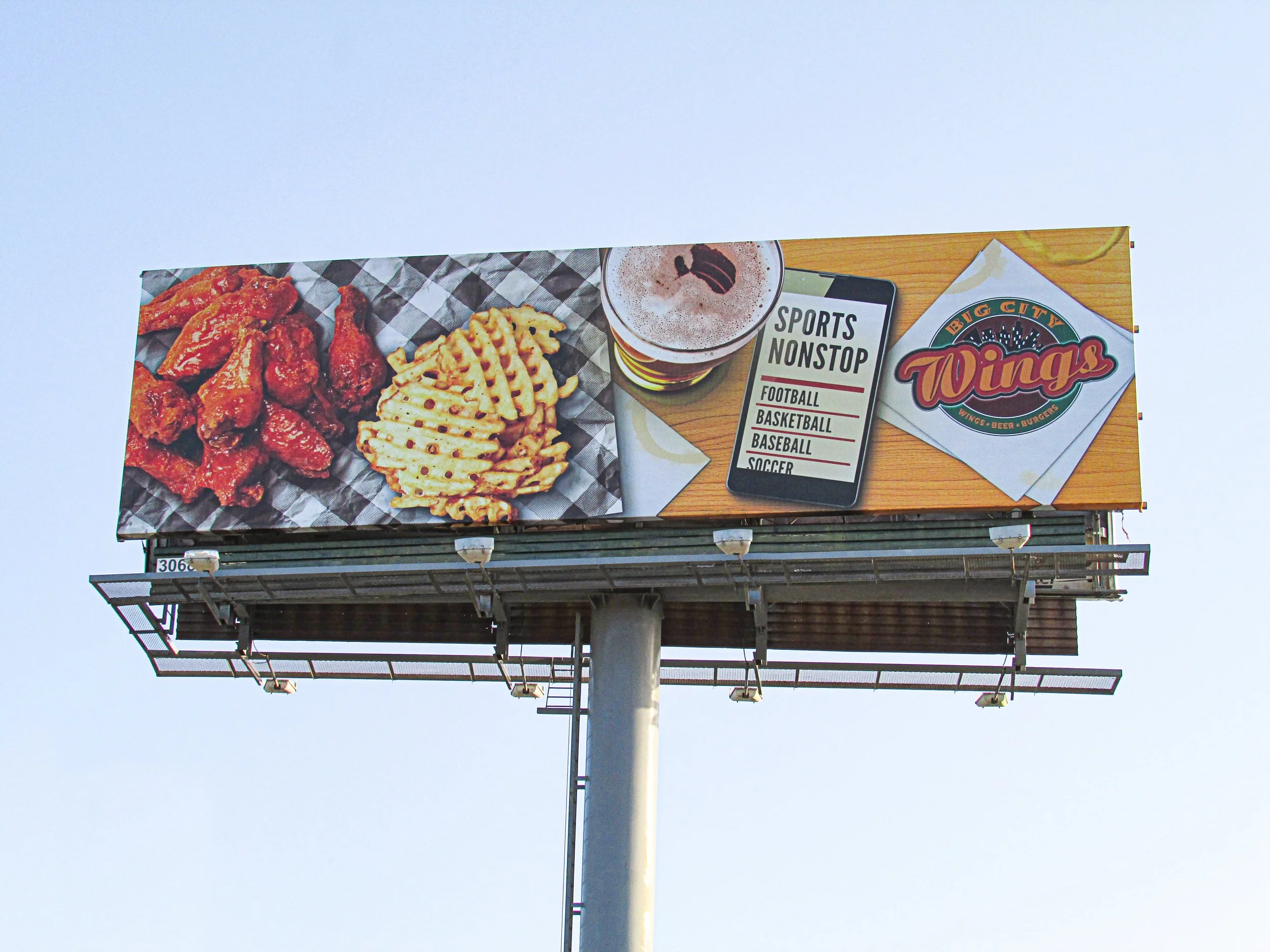
Big City Wings
Wings sports bars are a dime a dozen. And they often boast similar things, unless you’re a Hooters, Twin Peaks, or some knock-off sleazy derivative. Big City Wings was different. And they knew it.
Big City Wings was your neighborhood wings sports bar. Did they want to expand beyond one location, sure. But their neighborhood patrons, and by extension other Houstonians nearby were their primary concern. They wanted to be the place of familiarity. Come in. Grab a beer. Watch sports. And either chat with other regulars or keep to yourself. No fuss. No frills. Just cold beer, wings and more sports than you could hope to watch. We took this mantra and ran with it.
The types of people they were after, were into the type of campaign that we came up with. Rather than a giant surge in traffic, they saw a slow, steady increase in customers as people saw the board and customers got to talkin’. And it stuck. No splashes or surges, just consistent growth.
Not sure where to start with your restaurant billboard? Or how to even talk about where to start with your restaurant billboard?
We know some folks that could help with that. They’re an out of home advertising agency called Up To Something. Actually that’s us, Todd Turner and Richard Molinaro. Or just Todd and Richard if you’re into the whole brevity thing.
You need a campaign from concept to post (don’t know what that means?). Todd and Richard.
Need that campaign to carry over into social media, print, onsite ads, or email marketing. Todd and Richard.
Maybe you want pointers on your current restaurant billboard campaign? Yep, Todd and Richard.
Shall we?


